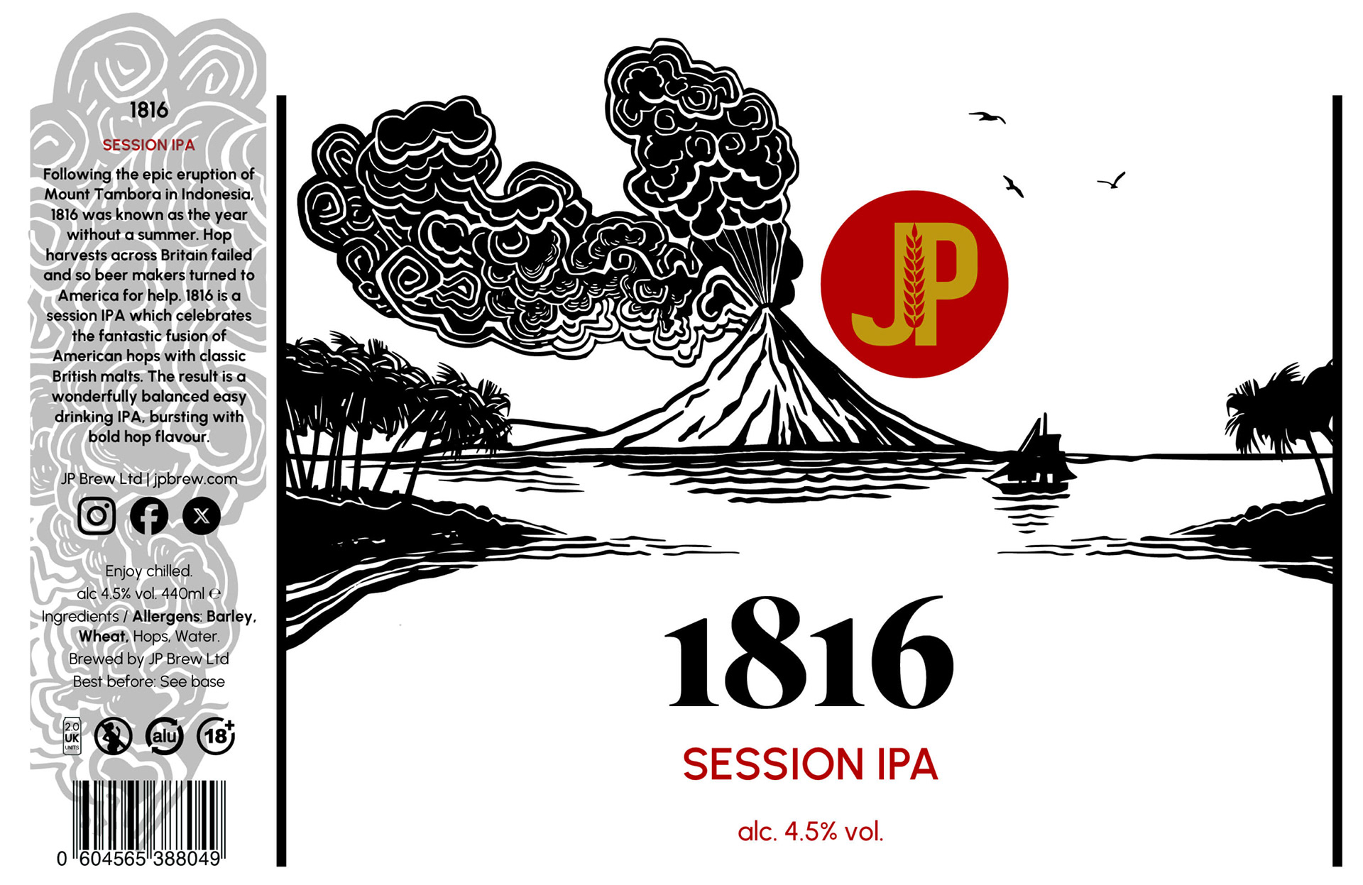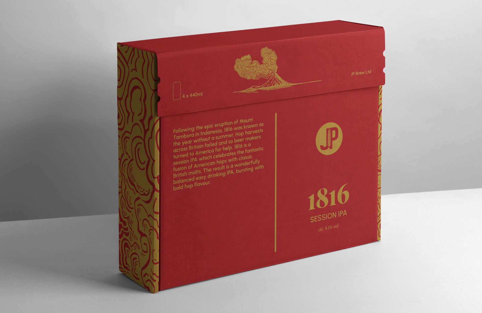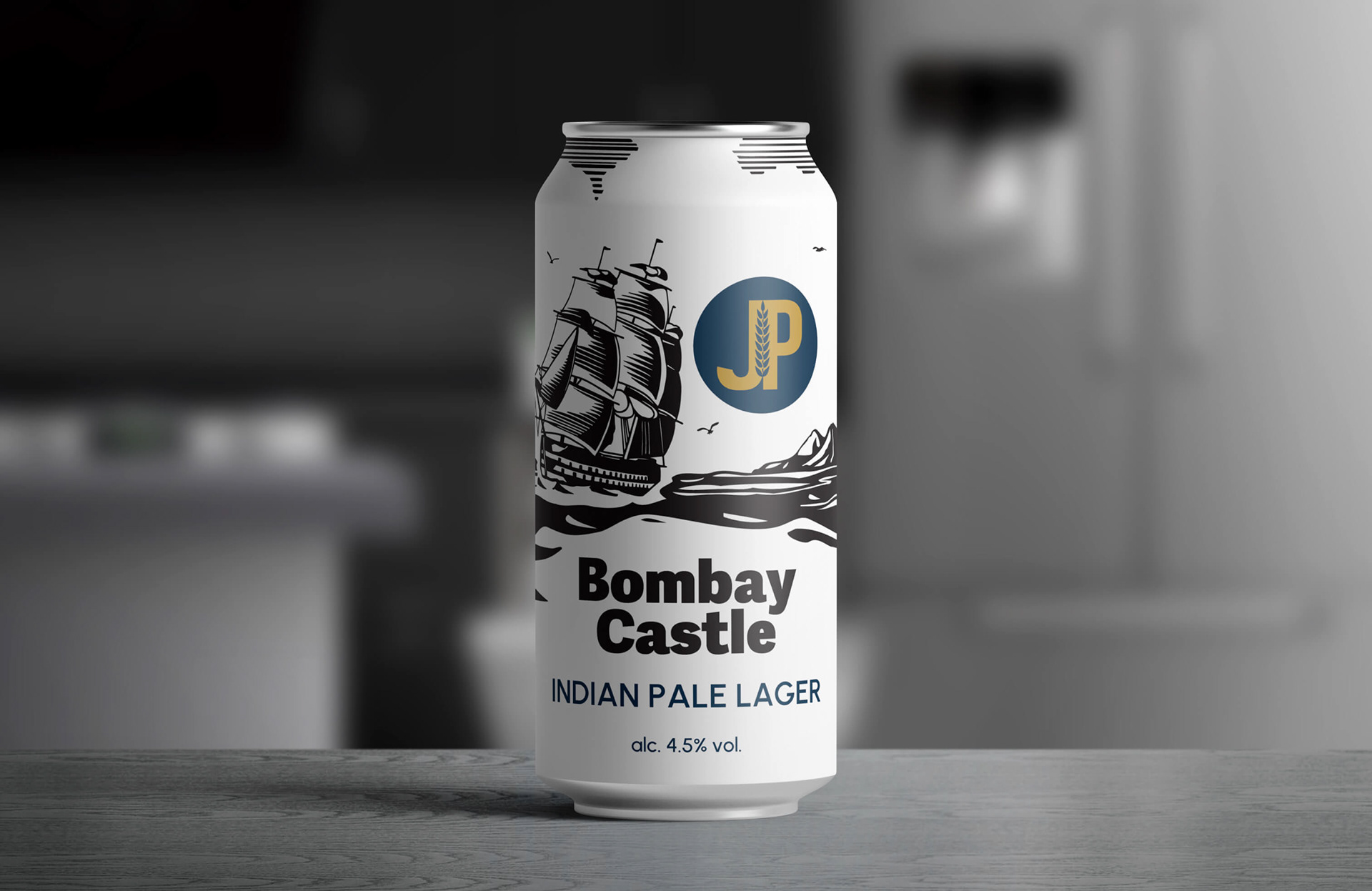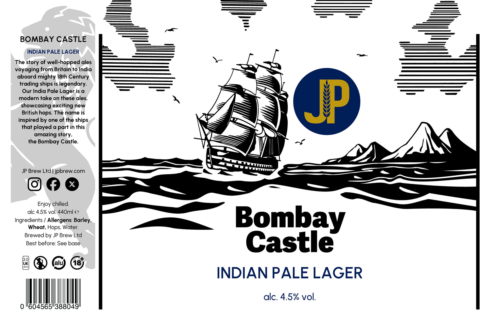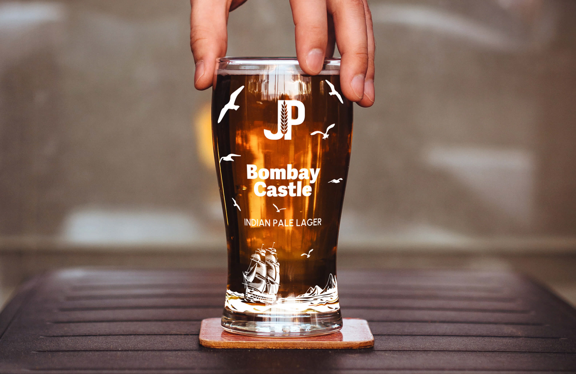
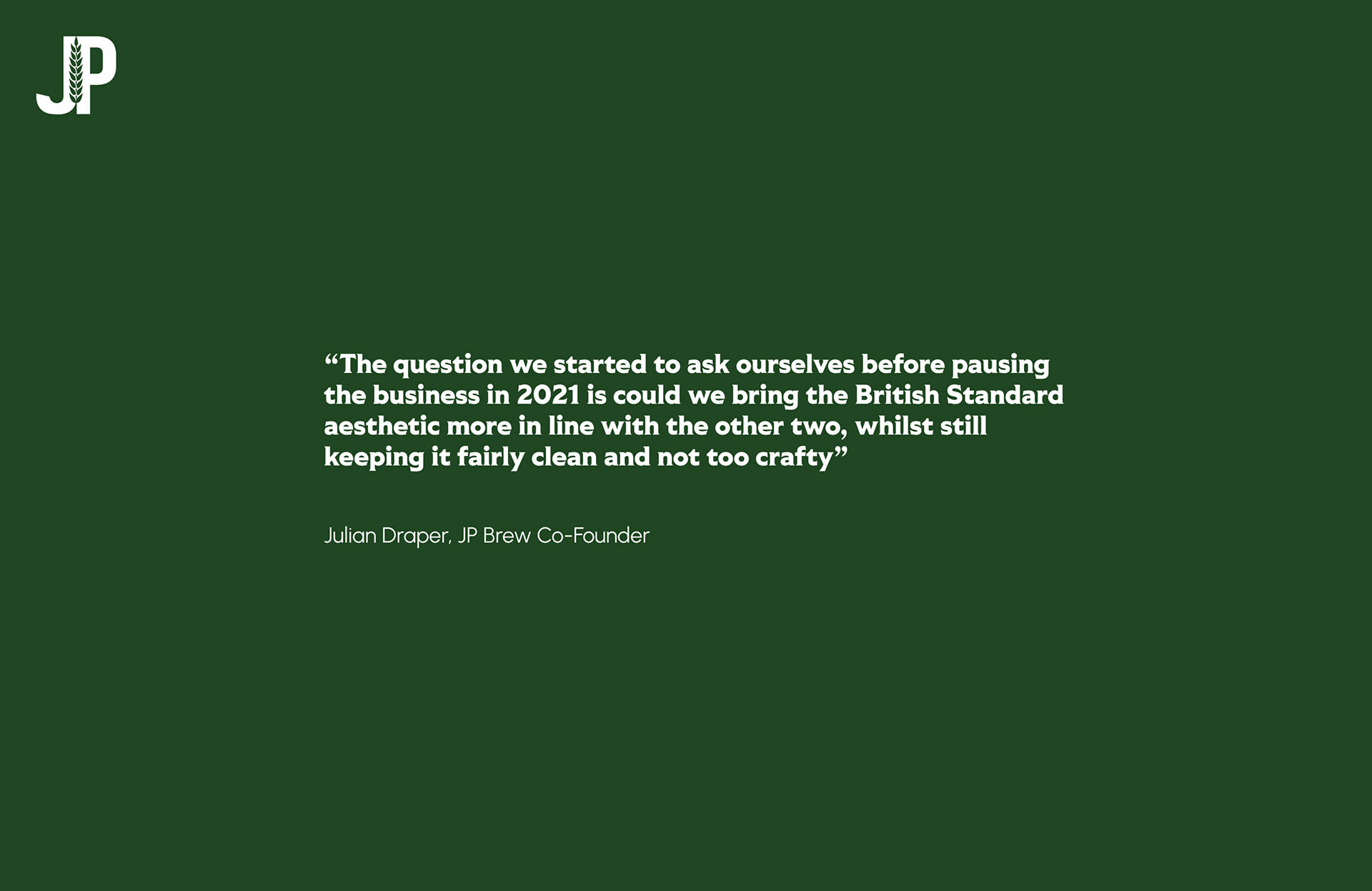
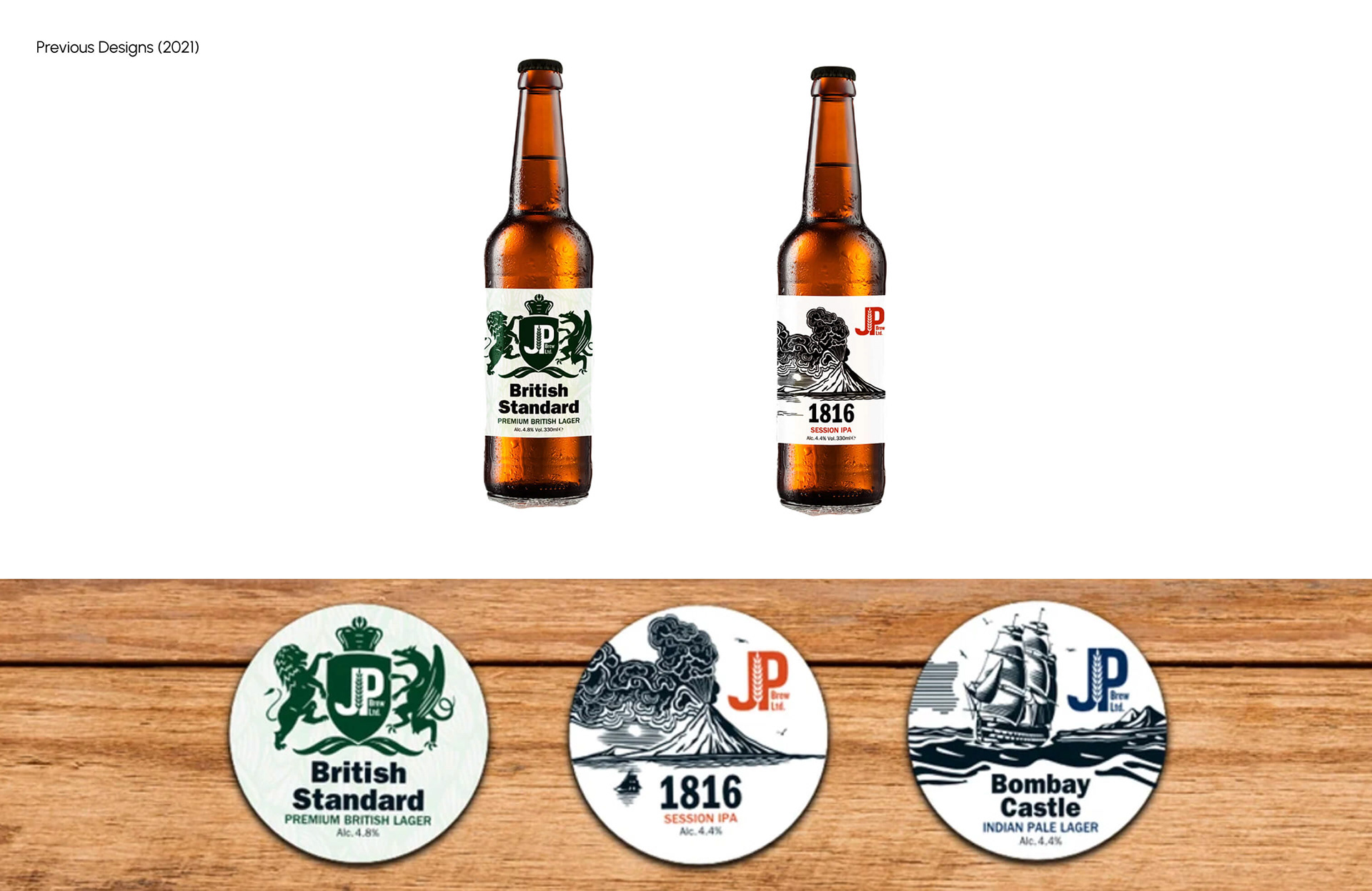
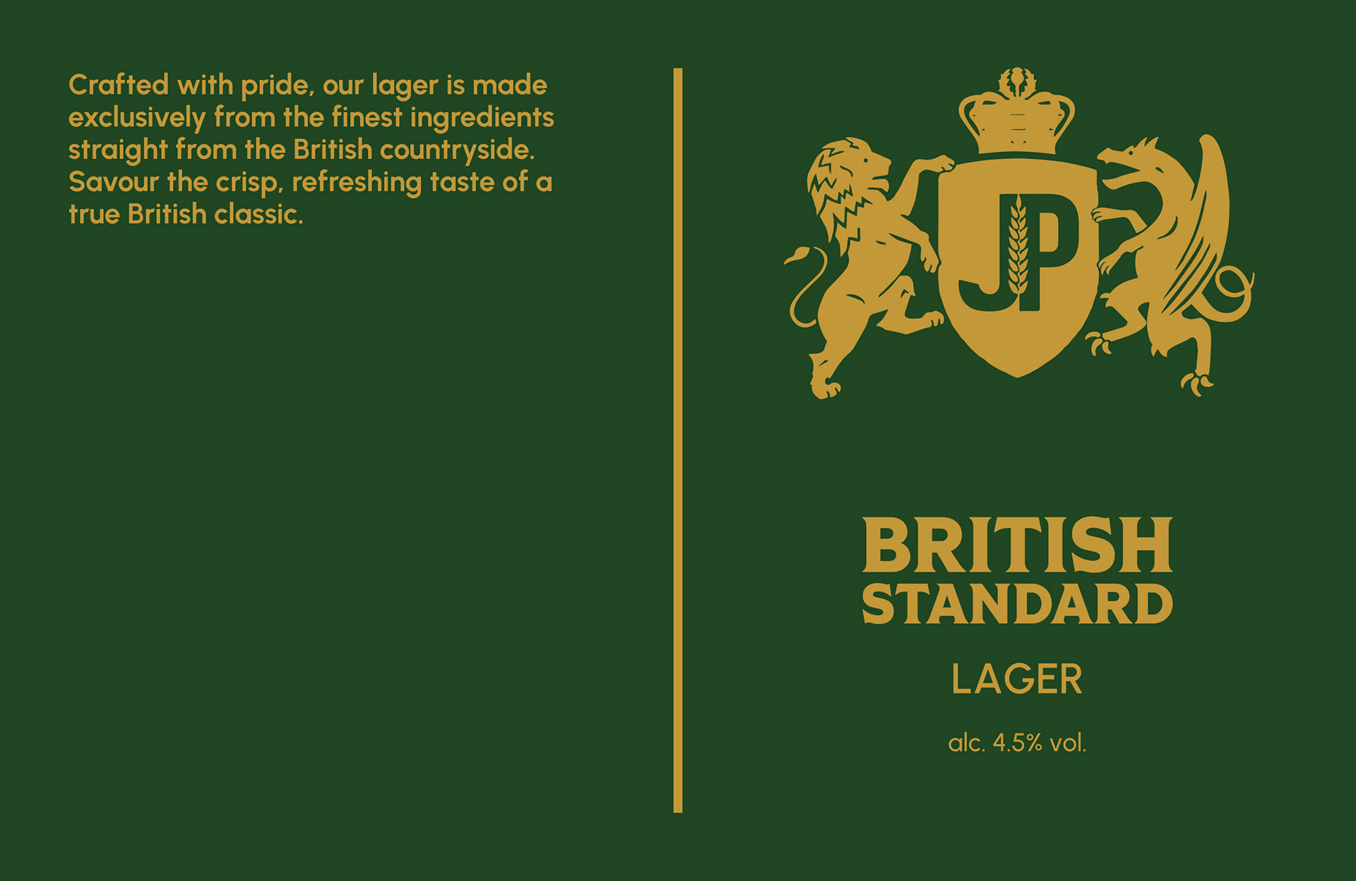
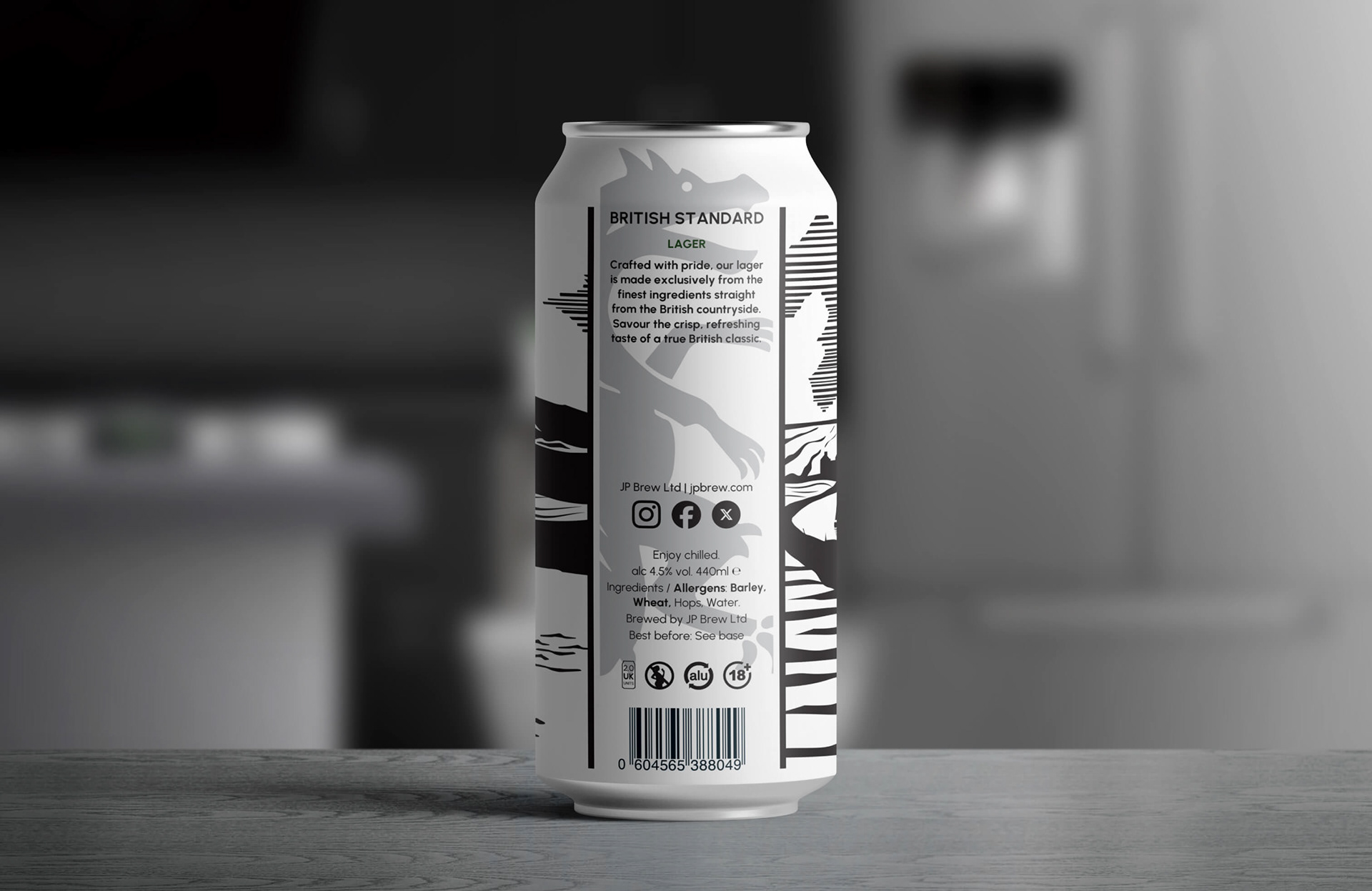
We were approached by JP Brew for a brand refresh ahead of a planned relaunch of their flagship British Standard lager, following pausing the business in 2021 due to Covid. JP Brew wanted to bring the British Standard aesthetic more in line with their other two beers – 1816 and Bombay Castle, whilst still keeping it fairly clean and not too crafty. JP Brew were also keen to refine and update other elements across their range, including the brand logo, typography and lino-print style illustrations to suit a proposed move from glass bottles to aluminium cans.
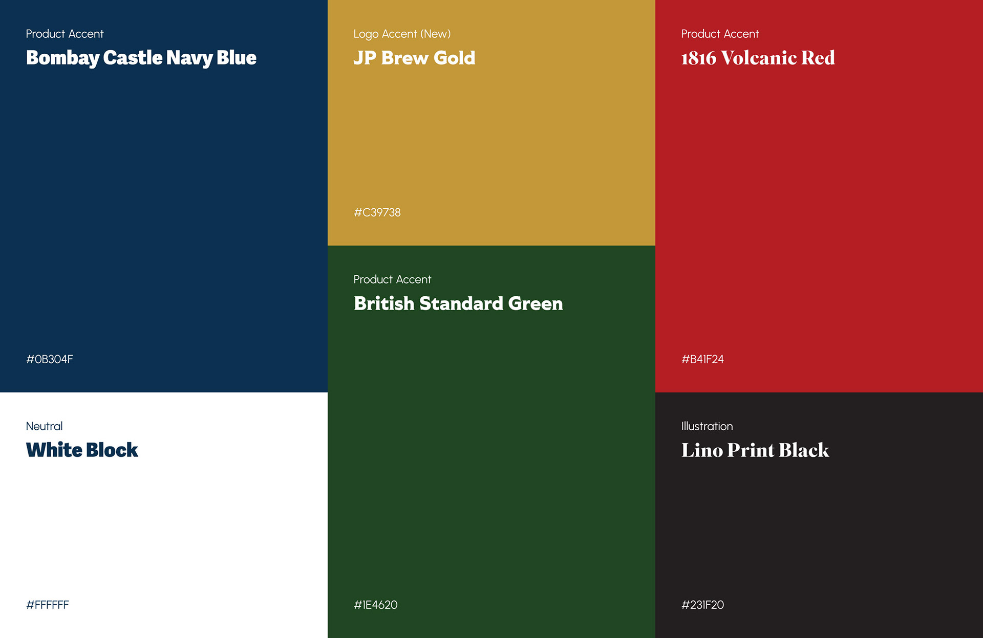
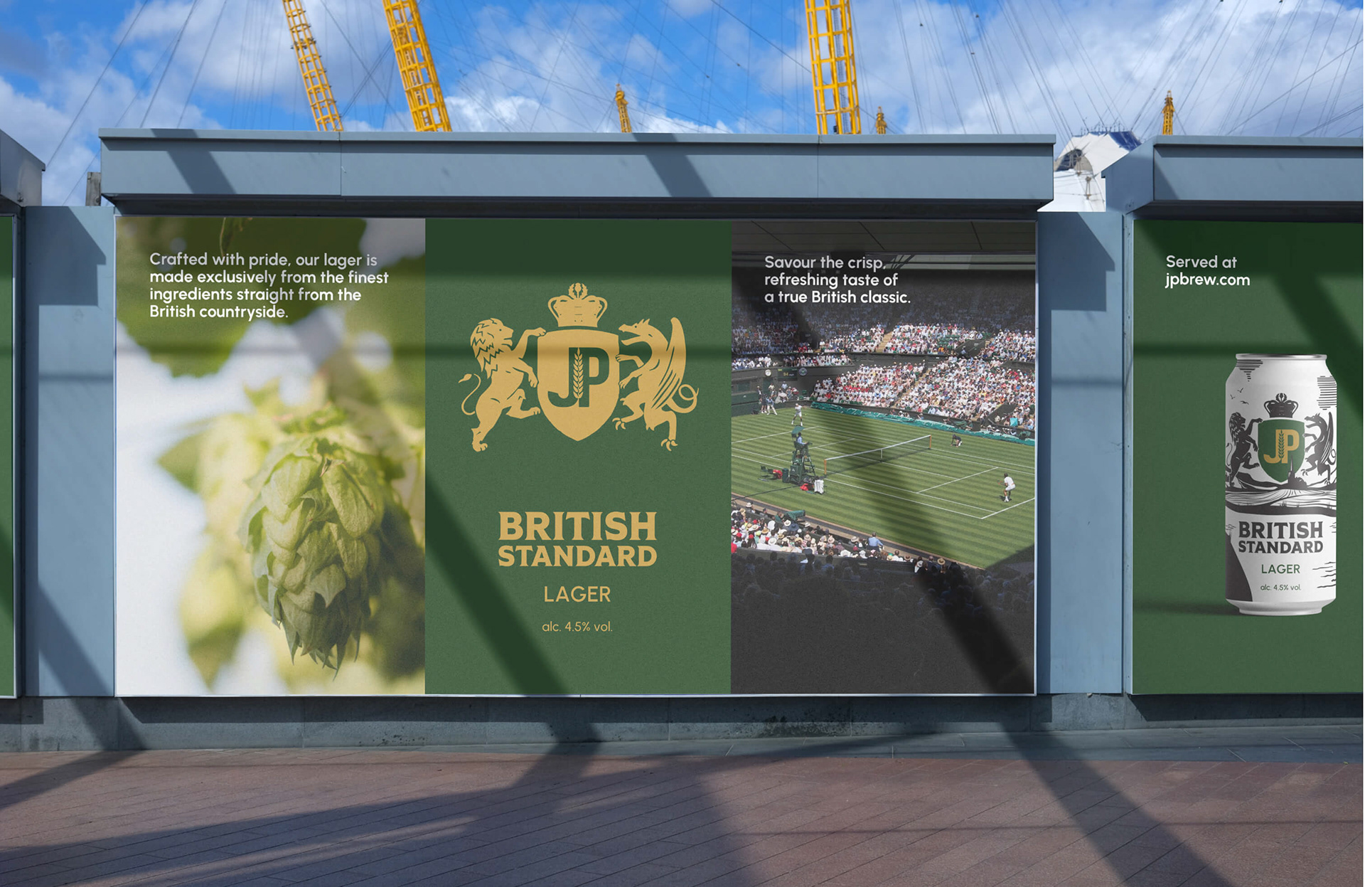
The brand refresh aspires to create a modern-classic identity by enhancing the distinctive brand personality which looks to strike that sweet spot between traditional and modern. Brand colours are intended to evoke a strong connection to British visual identity – such as racing green and passport navy blue – to reflect the ingredient origins.

The new British Standard illustration draws inspiration from Welsh-English border landscapes like Ross-on-Wye to reflect the respective backgrounds of the two co-founders, Julian and Paul.


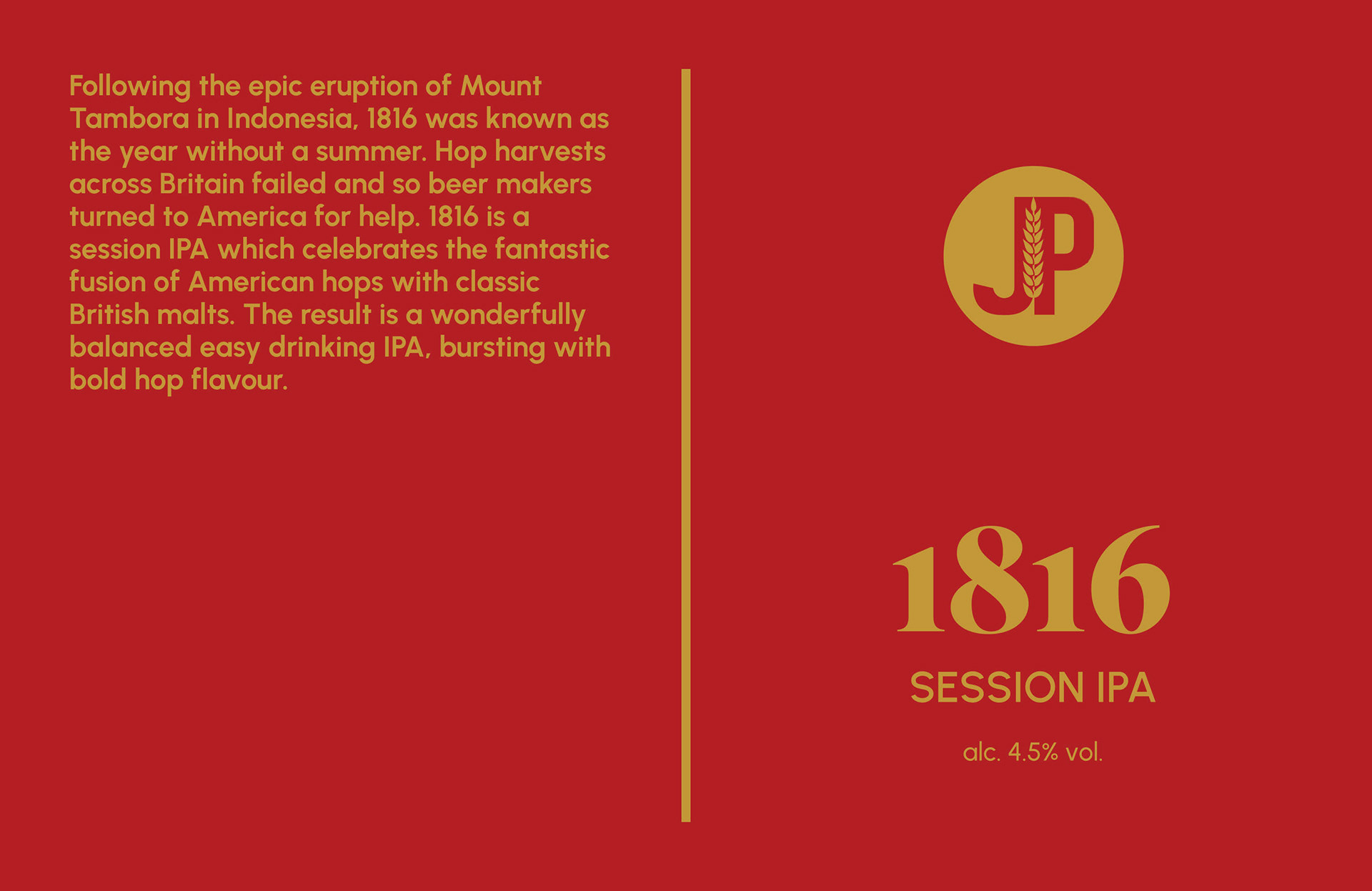
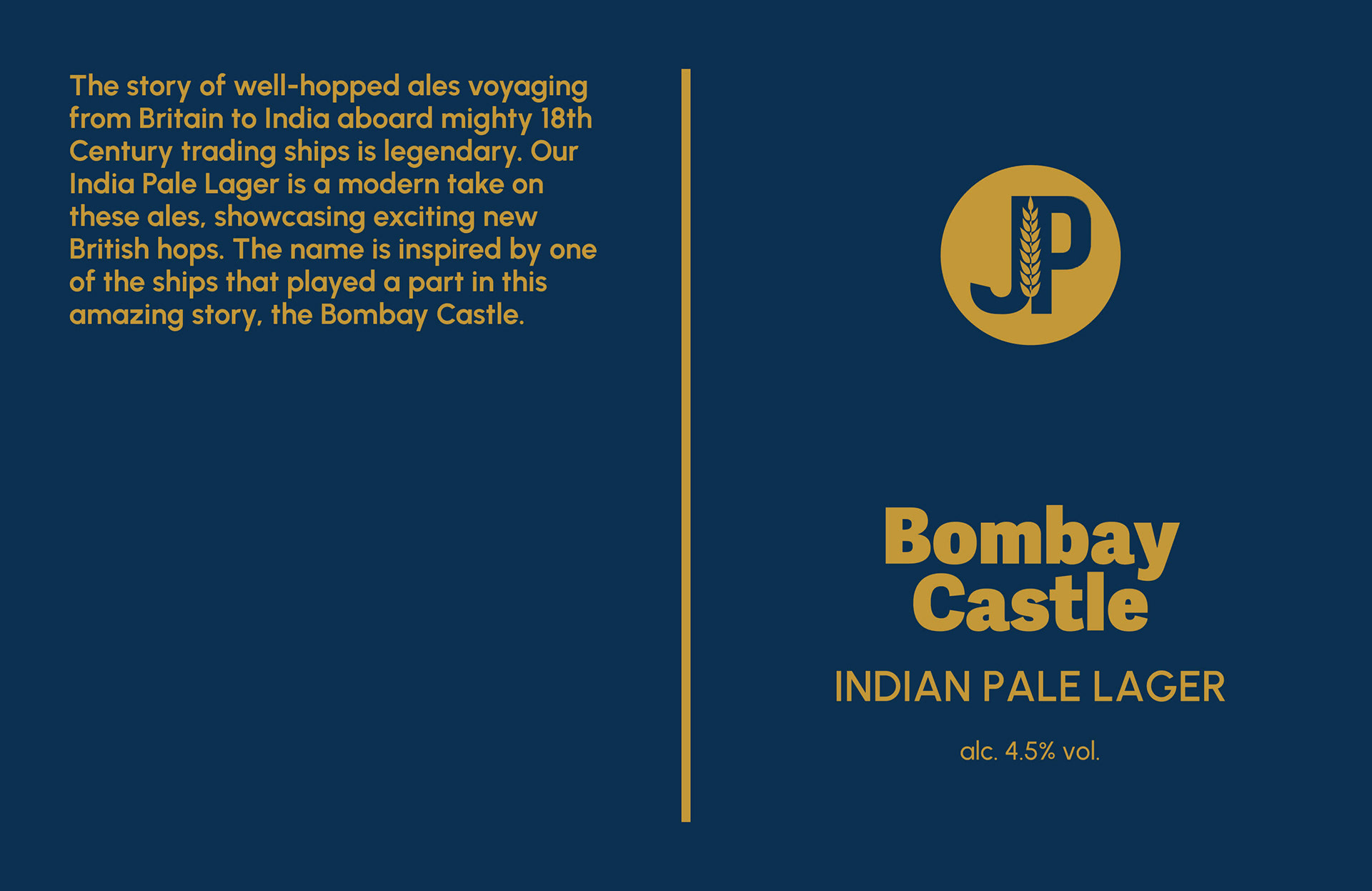
New typography for each of the three label names has been chosen to reflect the story behind each and improve the variety distinction.